Your
artwork should, in some way, be representative of you…your
vocal style or quality, personality, quirkiness, or some other aspect
of who you are. It should establish your identity and, hopefully,
a lasting impression.
Samples: Page
1 | Page 2 | Page
3 | Page
4 | Page 5
|
Heather
Winter:
Surprisingly,
this assignment became a challenge; because even though the name Winter seems
like an easy name to work with, relating it to voice overs became
an unexpected hurdle.
A
good idea that seemed to get better and better as we went along,
the snow globe met all our marketing needs:
1.
Nothing says winter like a snow globe.
2. You can put anything inside of it pertaining to v/o’s…we chose
a vintage microphone.
3. The slogan seemed to write itself. What do you do with a snow globe?
You shake it up. Bingo! It’s the perfect slogan, because it unites
the reason for hiring Heather with the winter identity and branding to
her name and what she’s promoting.
4. Snow globes had made a comeback in popularity so using the image seemed
timely…yet another plus. And because of the snow globe’s popularity,
it was relatively easy to find all kinds of inexpensive snow globe give-aways
and tie-ins.
Graphic
artist, Chrissie Vales, enhanced the winter feel by using an
icy, purplish-gray overall color. A touch of red is the only
splash of color bringing focus to the all important mic. On the
back cover, we often like to give some sort of description of
the sound or styles one might hear from a talent and with a splash
of a few cool colors, we squeezed in a few descriptive adjectives
inside the globe adding a little fun and whimsy to the piece.
Also, by using the same artwork, the back cover becomes a cost
effective way of adding additional information without incurring
huge graphic costs.
|

CD Front Cover

Inside Front Cover

CD Back Cover
|
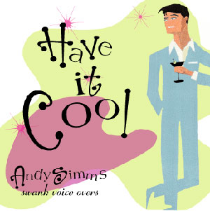
Andy
Simms:
I
had the pleasure of coaching Andy and producing his demo, so
I knew his style pretty well. He’s a pretty cool, hip, young
guy and his vocal style reflects just that image.
With
a resurgence of 50’s style advertising, we thought the
graphics, along with a cool and swanky martini guzzling guy of
that era, seemed hip and trendy and enabled us to project the “cool” image
we were looking for. It reflects not only the vocal style Andy
projects on his demo but his own personal style as well.
Andy
was an easy client to please; he let us have fun with kitchy
words of the time like swanky and cool and double entendres with
the whole martini association a la the copy for the inside
and
back covers of the CD. |
CD Front Cover

Inside Front Cover
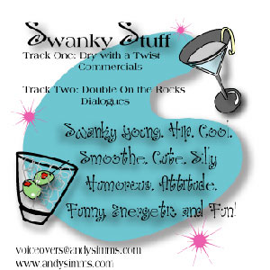
CD Back Cover
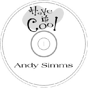
CD Art
|